Saturday, 10 November 2012

Between presence and disappearance

Buildings which play with the visual deception is a topic that has intrested me a lot after the comparision and understansting the way various architects represent architecture which is curcial theme in minimal architecture.

The two projects that struck me the most in this category were the
  1. Aplix factory,nantes, france by Dominique Perrault
  2. blur project,Arteplage Yverdon-les-bians of the swiss national exhibition 2002 by Diller+ Scofidio architects

Aplix factory,nantes, france by Dominique Perrault

dominique perrault in this project plays with the visual perception and revelation, with distortion and its correction.in this project which is a factory building, a modular structure build on a 'crossword puzzle grid' as he describes it, with facades of metal panels that like fresnel lenses refract and reflect their surroundings does not need a spectacular landscape as a frame.


 it is not designed for a specific site,it neither follows a definite typology nor makes any clear reference to the site.on the contrary it embodies the complex facets of meaning characterstic of such constantly changing industrial buildings in surroundings that themselves continously alter.what goes on inside remains completely mysterious.at the moment self-adherent fibre fabric and self supporting systems are manufactured there. but the facade, and the illusion it creates makes a person wonder.the vaguely shining sheet metal on the facade lets materiality of the factory blend into the surrounding landscape.'nature' is evoked as a blurred image

http://www.youtube.com/watch?v=WOY8NV-bXy4


blur project,Arteplage Yverdon-les-bians of the swiss national exhibition 2002 by Diller+ Scofidio architects

In this project the visbilty of the structure and the way people perceive it was taken to a higher level. all the visual and acoustic references were erased on entering the mist that the structure created and the senses were blured.In contrast to the traditional pavillions at world exhibitions in which senses are flodded with images, sounds and information,in the interior of the blur there was literally nothing seen. the opposite approach with the minimal technical expenditure to create something so minimal yet spectacular was something that took my intrest in this project.
http://www.youtube.com/watch?v=0WT5Lu1MKYs


The centerpiece pavilion of the the sixth swiss national exhibition is a suspended platform shrouded in a perpetual cloud of man - made fog, designed by architects elizabeth diller and ricardo scofidio. the cloud can host up to 400 visitors.


 The so called 'blur pavillion' is visible from afar. the building consists of a 60 x 100 x 20 - metre metal construction that sprays innumerable tiny drops of lake water from 31400 jets. the high-pressure spraying technology ensures that the fleeting sculpture will be visible in all weathers, rain or shine.


The high-pressure spraying is carried out by high-grade steel jets with tiny apertures only 120 microns in diameter, through which the water is forced at a pressure of 80 bars onto fine needlepoints directly above the apertures and atomised into innumerable tiny droplets 4 to 10 microns in diameter. the droplets are so small that most of them remain suspended in the air. if sufficient jets are installed in a specific volume, they saturate the air with moisture and create the effect of mist or, in this case, the effect known as the blur.


Wednesday, 7 November 2012

Modes of representation-transperency vs illusion

TRANSPERENCY

Acheiving the art of dynamic movement inside a strict grid and also using a transprent facade throughout the building and yet acheiving privacy in the places required is something that attracted me to this project by wiel arets.


 The concept of the building was implaning a alien elemnt in the existing sysyem of the city which is comparable to a virus entering a human body and causing changes in it.the extentention to the academy inserts itself into the existing ensemble at the same time creating a new urban space.


The building is made up of modular units, here the a simple basic principle creates a diversity of effects.the facades consist of glass blocks with different degree of transperency that are fitted into the concrete frame made of square bays, in addition at places horizontal windows are inserted.particularly with the artificial-lit interior of the academy corresponds with the city outside, making the process of movement,communication and work visible.


The architect states that " Architecture is therefore a membrane, a alabaster skin,at once opaque and transperent,meaningful and meaningless, real and unreal"


In the intreior of the academy is also marked by the openness and at the same time by the industrial overtones supplied by the materials concrete and glass. the circulation system is entirely based on communication. from a single entrance which leads to the different parts of the building that are connected with each other by a bridge.


ILLUSION

The arcadia lightwear builing done by sadar vuga arhitecti is the example i have taken to show the comparision between representation of transprency vs illusion in the representation of the architecture.


The ambivalant game of representation characterstics of a building for arcadia lightwear, a slovenian lighting planner and light fitting manufacturer is done well by the architect. instead of displaying its function outwardly with an effectively illuminated peice of architecture, the building presents itself with a deep, dark blue facade that draws the gaze into a black hole.


the showroom concealed behind in a certain sense acts outwardly as a 'hiding room'. only the building's recessed ground floor is covered with a shiny foil that at night reflects the light cast by the headlamps of the passing cars. that is to say, the buiding does not light up, it allows itself to be lit up. at the same time the architecture does not make this principle its sole concept. the offices and warehouse are not incorporated in the box oriented towards the rear and allows themselves to be recognised what they are. in contrast to the mainstream minimalism the architect is not primarily intrested in the creation of an aura around their architecture but in showing how such an aura is produced.


                              ground floor plan

       first floor plan


                             sections


                                                                site plan

Monday, 5 November 2012

Less is More

                    MINIMALISM IN ARCHITECTURE

After studying david chipperfeilds work i was keenly intrested in the minimalistic architecture and the roots of it and various other architects who practiced it extensively.

Architect Ludwig Mies van der Rohe  coined the motto "Less is more" to describe his aesthetic tactic of arranging the numerous necessary components of a building to create an impression of extreme simplicity, by enlisting every element and detail to serve multiple visual and functional purposes.


He was not one of the first architects to practice minimalism but was the one to take the principles of it to new levels.His glass-walled Farnsworth House near Chicago stirred controversy and legal battles. His bronze and glass Seagram Building in New York City (designed in collaboration with Philip Johnson) is considered America's first glass skyscraper. And, his philosophy that "less is more" became a guiding principle for architects in the mid-twentieth century.
http://www.youtube.com/watch?v=8M3p9iKITaA
http://www.youtube.com/watch?v=Z-JHaP9bdBY


In minimalism, the architectural designers pay special attention to the connection between perfect planes, elegant lighting, and careful consideration of the void spaces left by the removal of three-dimensional shapes from an architectural design. The more attractive looking minimalist home designs are not truly minimalist, because these use more expensive building materials and finishes, and are relatively larger.

Designers such as buckminister fuller took the statement 'less is more' and modified it into 'doing more with less'. he was the inventor of the geodesic domes.his inspiration from the minimalistic architecture gave some great inventions to the world in the feild of architecture.


The idea of simplicity appears in many cultures, especially the Japanese traditional culture of Zen Philosophy. Japanese manipulate the Zen culture into aesthetic and design elements for their buildings. This idea of architecture has influenced Western Society, especially in America since the mid 18th century. Moreover, it inspired the minimalist architecture in the 19th century.

the other important architects who practice minimalistic style of design are
tadao ando
john pawson
alvaro siza
alberto campo baeza.


Saturday, 3 November 2012

David Chipperfield

       works inspiration-David chipperfeild

 
After my visit to the david chipperfeild's wakefield hepworth gallery and having experienced minimalistic architecture done by the master it invoked me to look at his various other projects.
 
                                                                   His style of approaching the design in a philosophical context with
a strong research behind it and then the subject being reduced to its necessary elements striked me the most of all.His strong sense of geomerty and interaction of light in the spaces designed were another inspiration in design for me.


Going through his other projects especially his approach towards museums and galleries to understand his minimalistic style in different contexts other than the hepworth gallery.
i found 3 projects the most striking


 1.MUSEUM OF MODERN LITERATURE MARBACH
     
The museum is located in Marbach’s scenic park, on top of a rock plateau overlooking the valley of the Neckar River.The views around the site are spectacular with historic buildings on it.the museum reveals different elevations depending on the viewpoint. By utilising the steep slope of the site, terraces allow for the creation of very different characters – an intimate, shaded entrance on the brow of the hill facing the National Schiller Museum with its forecourt and park, and a grander, more open series of tiered spaces facing the valley below.


A pavilion-like volume is located on the highest terrace, providing the entrance to the museum. The interiors of the museum are seen as one descends down through the loggia, foyer and staircase spaces, preparing the visitor for the dark timber-panelled exhibition galleries, illuminated only by artificial light .At the same time, each of these environmentally controlled spaces opens into a naturally lit gallery, balancing views inward to the composed.


A clearly defined material concept using solid materials (fair-faced concrete, sandblasted reconstituted stone with limestone aggregate, limestone, wood, felt and glass) gives the calm, rational architectural language a sensual physical presence.


section showing different elevations depending on the viewpoint.


pavilion-like volume is located on the highest terrace, providing the entrance to the museum


2. NEUES MUSEUM AT BERLIN

A building which was a key work of art, hitory in the 19th century and destroyed in during the second world war which has been elaborately restored and recreated under the direction of the British star architect David Chipperfield. The building now provides a new home for the Egyptian Museum and Papyrus Collection and the Museum of Prehistory and Early History, together with artefacts from the Collection of Classical Antiquities.


 The design focused on repairing and restoring the original volume, respecting the historical structure. Both the restoration and repair of the existing is driven by the idea that the original structure should be emphasized in its spatial context and original materiality – the new reflects the lost without imitating it.


The key aim of the project was to recomplete the original volume of the parts that remained after the destruction of the Second World War. The original sequence of rooms was restored with new building sections that create continuity with the existing structure. The archaeological restoration followed the guidelines of the Charter of Venice, respecting the historical structure in its different states of preservation. All the gaps in the existing structure were filled in without competing with the existing structure in terms of brightness and surface.


The new exhibition rooms are built of large format pre-fabricated concrete elements consisting of white cement mixed with Saxonian marble chips. Formed from the same concrete elements, the new main staircase repeats the original without replicating it, and sits within a majestic hall that is preserved only as a brick volume, devoid of its original ornamentation. Other new volumes – the Northwest wing, with the Egyptian court and the Apollo risalit, the apse in the Greek courtyard, and the South Dome – are built of recycled handmade bricks, complementing the preserved sections. With the reinstatement and completion of the mostly preserved colonnade at the Eastern and Southern side of the Neues Museum, the pre-war urban situation is re-established to the East. A new building, the James Simon Gallery, will be constructed between the Neues Museum and the Spree, echoing the urban situation of the site pre-1938


3. CITY OF CULTURES, MILAN

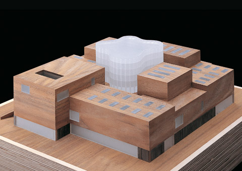
The campus of museums is located in between a unused industrial area. the inspiration of the building was the typical milan streets with intricate inner courtyards and how they act in space.
the design looked to emphasise the exsisting qualities of the site which i found intresting.
the most impressive part of the design was the approach where the new building was designed in contradiction to the surrounding industrial buildings making it stand out and somehow including the surrounding buildings to emphasise its own beauty and hence restoring them.

There is a square where a king of great hall is designed through which the public move towards the different exhibition spaces.  The spaces can be acessed without necessarily having to enter the museums. Nothing looks out onto the street, the building complex is developed inside a perimeter of existing buildings, around a central courtyard with a curious flower like or amoeba shape. “The advantage of this is to have a kind of orientation space, a place of transition between the outside world and the museum areas, a space which can also be used for collateral events open to the public which are not necessarily exhibitions”


Chipperfield describes the building as “an onion”; the public area is the outside layer, gradually moving through the galleries you move deeper into it. It is accessed at ground floor level – a kind of transparent plinth in glass and mirror, whilst the rest is clad in titanium zinc – to then, via a series of complementary activities which exploit both the entrance and exit of the museum (ticket office, bookshop, library…), move up to the first floor where the main exhibition rooms and the auditorium lie. On the top floor a restaurant faces onto the courtyard which may be used independently from the rest of the building.


The walls are made of a double layer of translucent glass, house the system of walkways and will also be used as a projection screen and to display the museum collections.

The decision to preserve the original character of the pre-existing buildings and especially those linked to an industrial function, such as the metal shutters and the use of concrete for the floors adds character to the design.

From an architectural point of view, the solutions adopted are extremely flexible, in order to allow the structure to adapt to the needs and functions of the different environments.